In October of 2020 I launched my own freelance website design business – Designed By Kam LLC. Over the years, my company’s branding and aesthetic has evolved through a couple different design iterations.
Logo
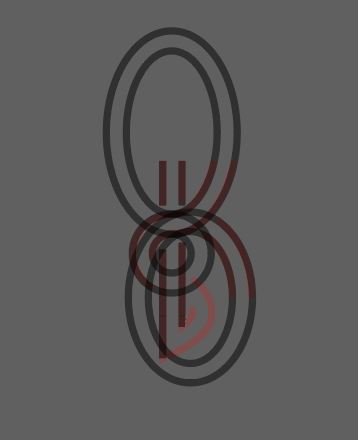
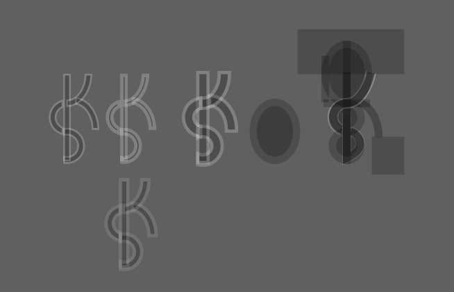
Starting out with the logo, I wanted to incorporate the initials of my business “DBK” into one simple, minimalistic logo. After sketching out many ideas, I landed on my current logo – a lowercase d and b subtly woven into a K.


First Version
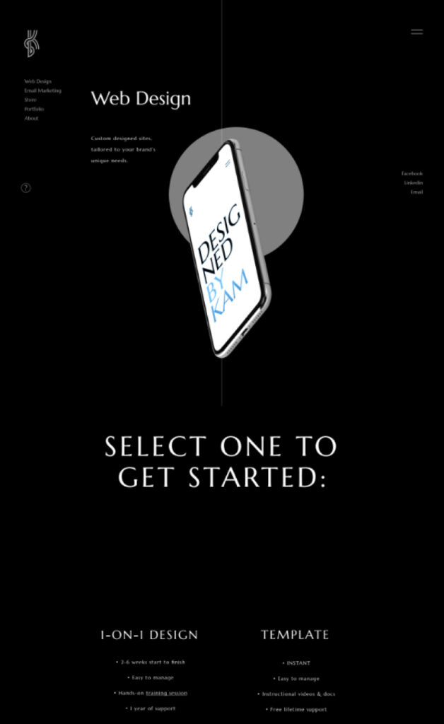
Designed in Figma and later built in WordPress, my initial design was a dark, sleek, dynamic design featuring customized graphics that moved in response to the user’s scroll and mouse interaction. The iPhone graphics rotated and floated off the page opposite the large circles behind them and at different rates than the text to further emphasize the such as the iPhone graphics rotating and falling as the user scrolled down, and background images automatically cycling through my portfolio and testimonials.



Current Version
The latest version of my website is a brighter design that reflects the travels and adventures that I have been on throughout the last couple years of my life. I incorporated my own landscape photography and kept the overall design simple, yet dynamic by using parallax effects and entrance animations to keep the user engaged and easily guided throughout.
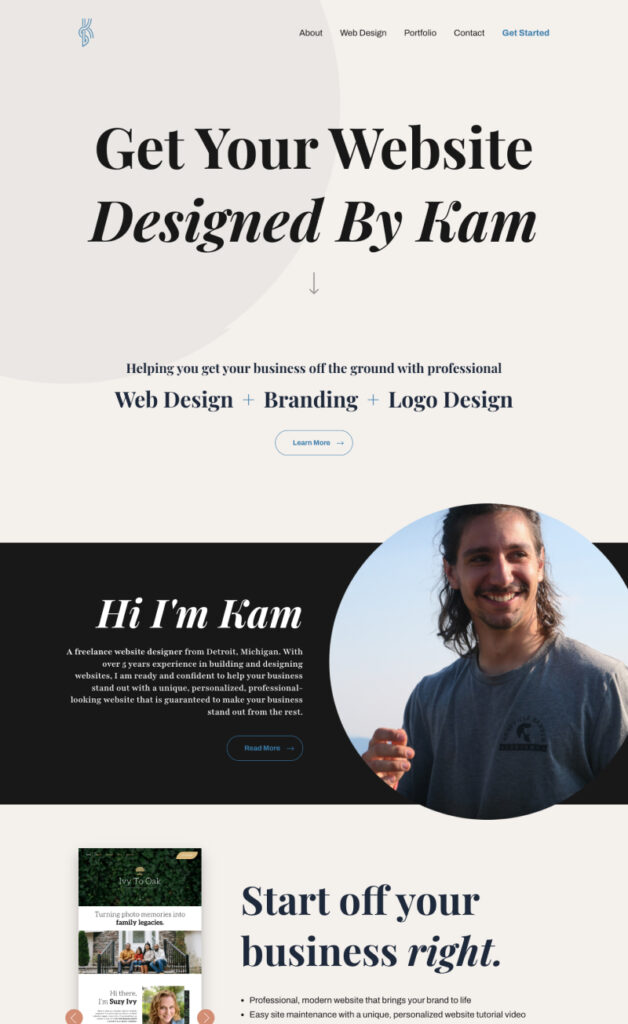


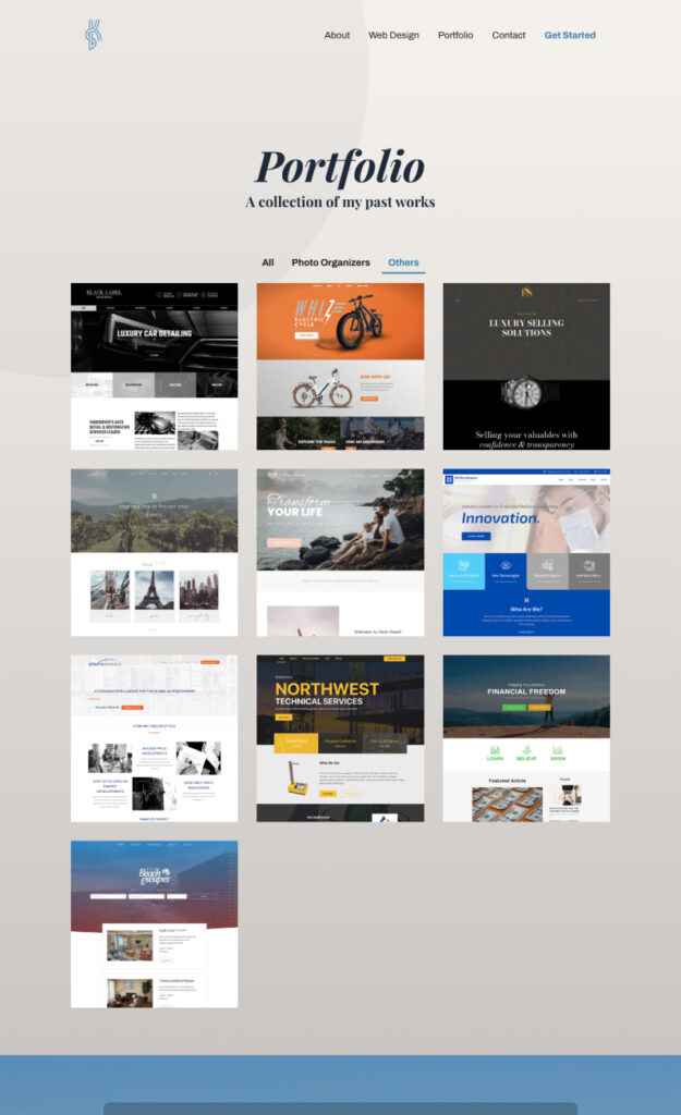
To view my current website, you can visit designedbykam.com